Other Projects
Masthead revamp HDB Resale Portal Meter UX Snapshots Other Projects
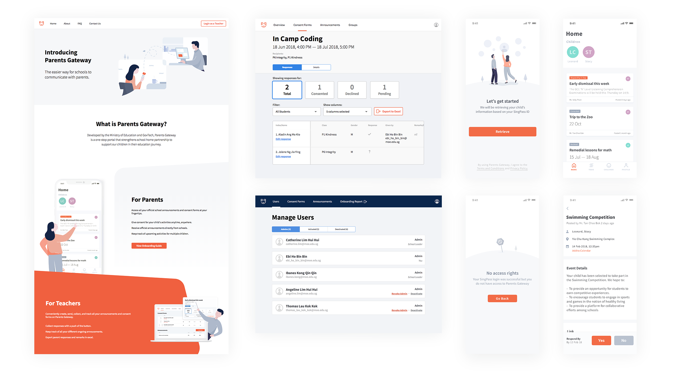
Parents Gateway is a web and mobile app that strengthens school-home partnership to support students in their education journey. Developed together with the Ministry of Education, the product aims to reduce the administrative workload for teachers.
Visit live site App Store Play Store
I am part of a two man design team for the mobile (react native) and web app (react). I cover all the product design needs from research, usability testing, monitoring analytics, giving input to the product vision and roadmap to the UI and interaction design explorations and illustrations.
Additionally, with both of us being designers who enjoy wokring in code, we often jump in to set up the base patterns and naming conventions for the various front end styles. (+ fixing minor styles along the way 😅)
Sketch, Framer, After Effects, Overflow, Airtable
Google Tag Manager, Firebase, React, React Native

Teachers in Singapore are overly bogged down by administrative matters in their day to day work. This takes away from their ability to focus on their core job – education.
Thus, the question for us was: How might we help teachers reduce their time spent on administrative work?
From there we mapped the various administrative matters a teacher has to deal with across the school year.
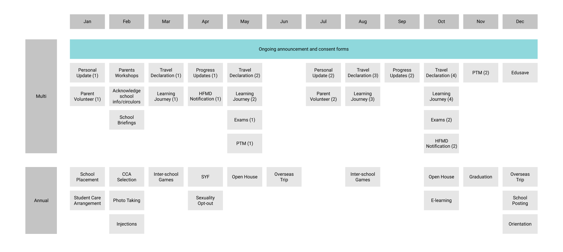
After a few session with various teachers, we found that sending announcements and collecting consent forms from parents was the most time-consuming activity (most frequent across the year + difficulty).
Today, teachers will distribute physical copies of a consent form or announcement to students to pass to their parents. Most forms will require a parent's signature. This leads to multiple issues including lost forms, mismatched schedules and so on, causing teachers to spend a lot of time chasing for them.
Additionally, parents, too, face mulitple issues with receiving the form from their child and returning the form on time etc.
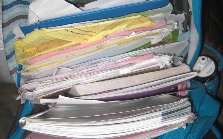 The form is in there somewhere
Thus, we decided to tackle this problem space first.
Given that the teachers will be dealing with a large amount of information, we choose to first develop a web app for schools. On the other hand, given the frequent and unpredictable nature of school announcements, a mobile app for parents was the most conveninet way to receive them.

I transitioned into the product team and started by working closely with the product manager to understand the product visions, user goals, business requirements and upcoming tasks. Over time, both products were designed incrementally through rounds of iterations and testings.
Throughout the way, we revised and refined the overall flow, cutting away many features for a more focused product (and a more manageable first launch).
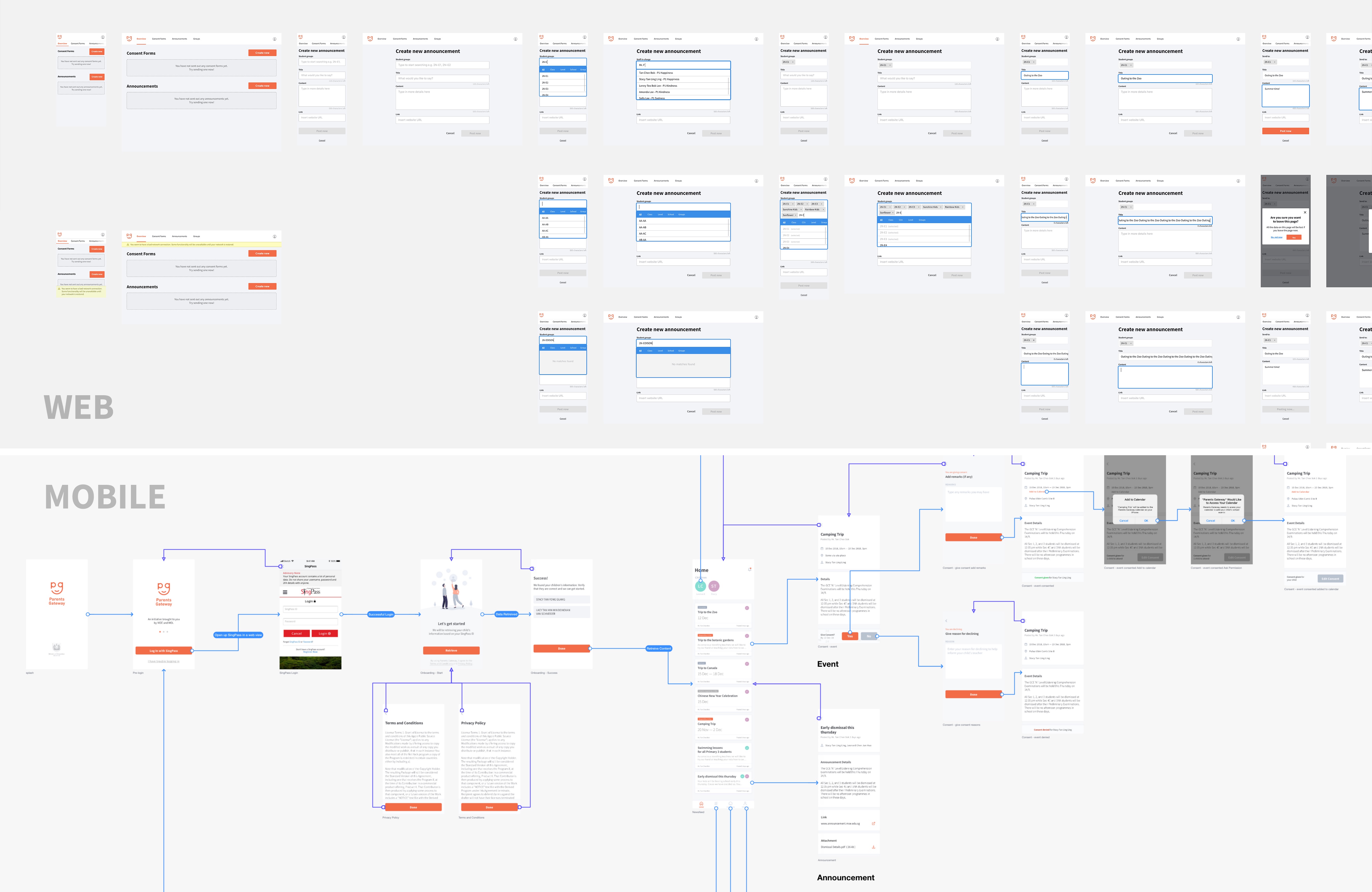
Along the way, there were some interesting design challenges we encountered:
When we were mapping out the flow of the product, retreiving the children's data based on the user's ID number sounded natural.
However, we soon had feedback that this was a problem for individuals with additional children their spouses are unaware of. As the government, it is not in our interest or intention to break families apart by revealing any possible family secrets.
Thus, we intentionally added a page to the flow, both to inform the user and add additional friction. The users can then make the call to either proceed with onboarding at a later date or move ahead.
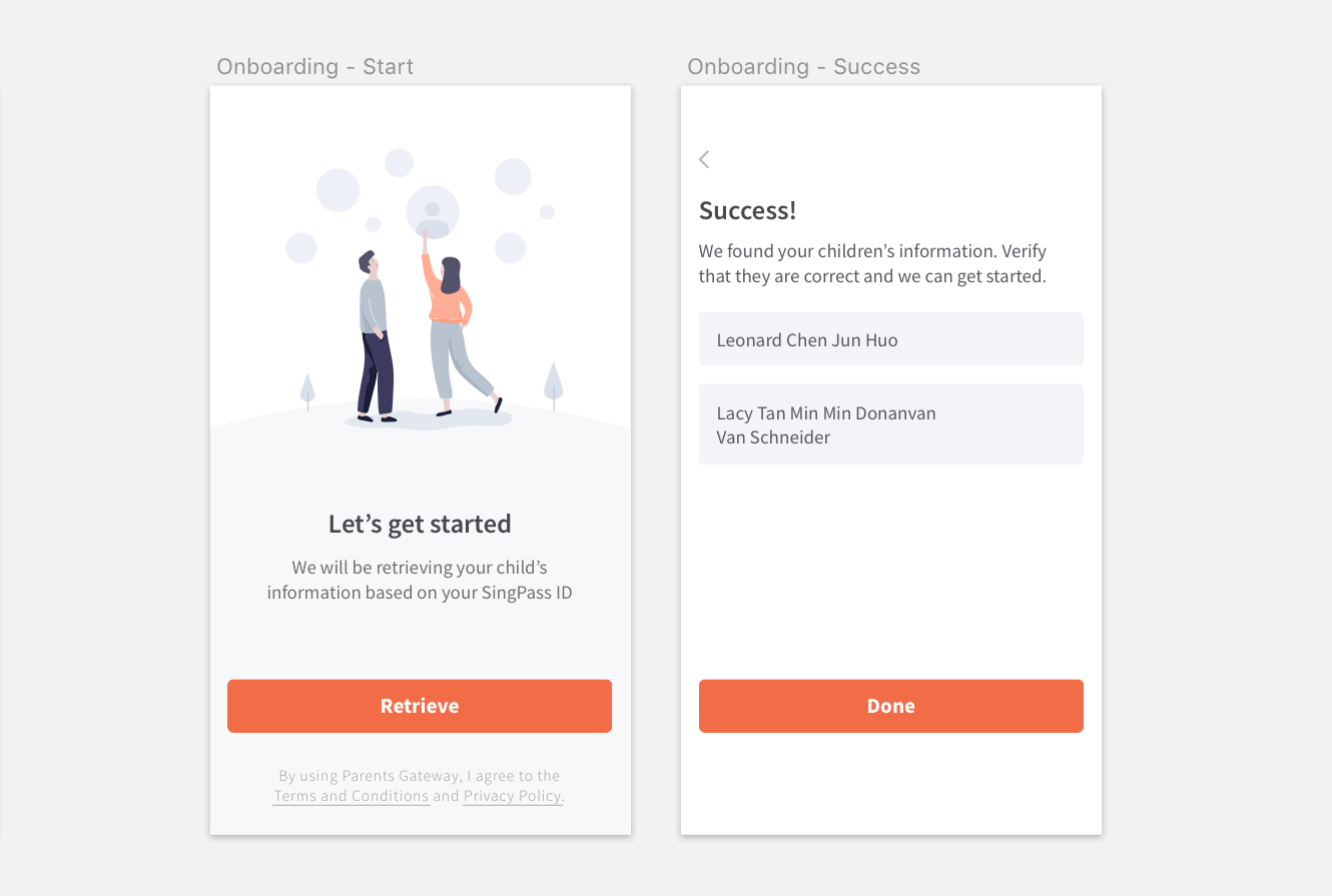 Confirmation page to retrieve data
For schools in Singapore, the administrator of the system (other than the school leader) is often, too, a teacher. This means that at any one time, an individual could be juggling both their tasks as a teacher and as an admin. After realising that the jobs to be done and mindset are distinctively different, we decided to clearly seperate the two.
This meant that the individual would be able to complete the tasks they need to do as a teacher, then cleanly switch over to the admin view to work on admin tasks, matching their current mental model.
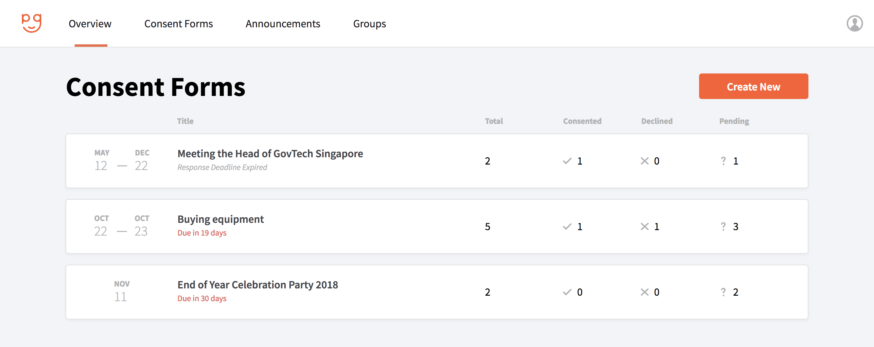 View for a normal user
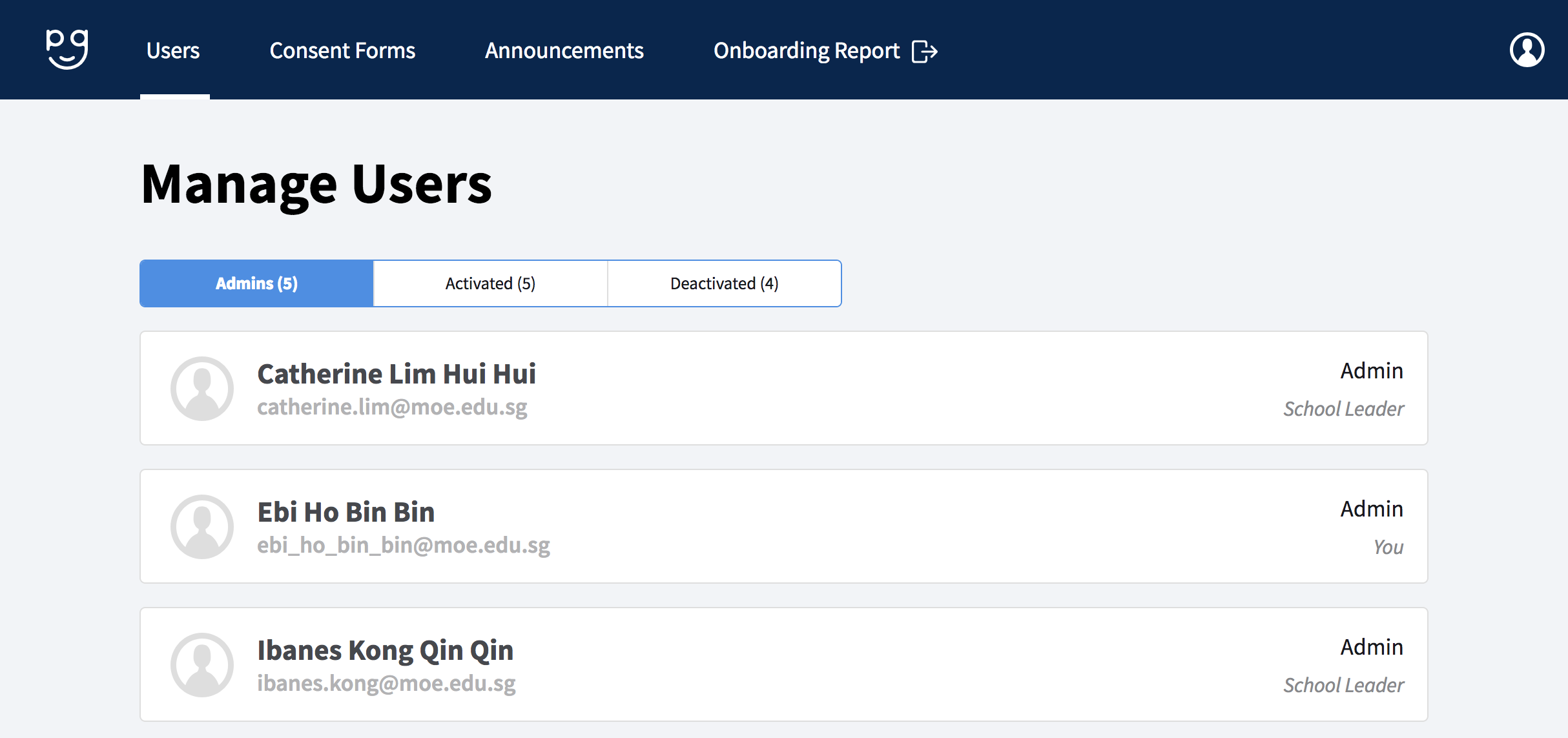 Admin View
Throughout the process, I have learned quite a bit about designing for performance and the trade-offs between lazy-loading and paginations.
I have also started to keep a list of pointers on designing for react native covering a few components like web view, alerts, keyboard avoiding view and push notification behaviors.
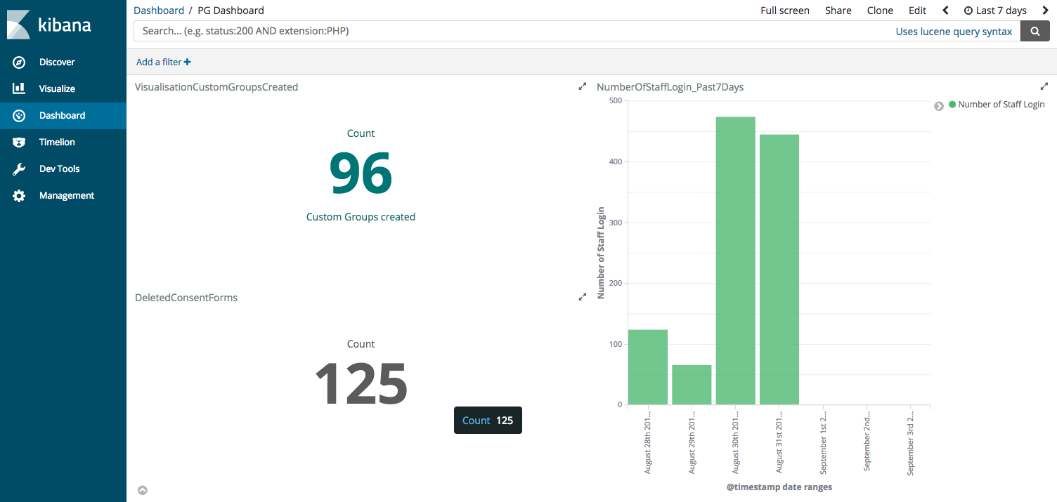
On top of my design work, I took up the initiative to define success metrics for the product together with the product managers and worked with the developers on collecting the necessary data and logs. We explored using Kibana to visualise logs as a quick way to get some insight into some of the metrics and are now working on a dashboard to pull real-time data from our DB.
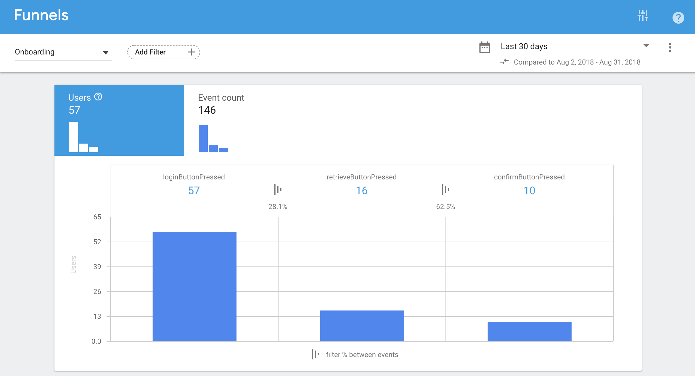
Plus, to track behavioural flows and funnels, I implemented firebase analytics for our react native app and google tag manager for the web app. Below shows the data collected for the onboarding funnel for our production server (high drop-offs from the first step since eng usually bypass onboarding 🙈).
I am grateful to be on a product team where I am empowered as a designer to give user inputs and guide the product direction. Along the way, I have learned a lot on what it takes to work with developers. Particularly so when I hit a roadblock trying to edit something in the source code.
While I did not elaborate on the design considerations for the web app here, that is probably a whole other complexity for another day.
Additionally, I giggle slightly at being able to return to my alma-meter to help design a solution for the problems they face. It lights up my face whenever a teacher or parent tells me how much this product would help them out.
I anticipate seeing how the product will fare with future releases. (and I hope to be a satisfied user one day 😉)

Masthead revamp HDB Resale Portal Meter UX Snapshots Other Projects