Other Projects
Masthead revamp HDB Resale Portal Meter UX Snapshots Other Projects
The Housing & Development Board (HDB) is Singapore's public housing authority. Over the span of a few months, we were tasked to work with them to digitalise and streamline the application process for buying and selling public housing a.k.a an HDB flat.
I assisted with the research and testing activities, produced deliverables (e.g. journey maps, service blueprints and reports) and lead the design of the UX flow and UI. Together with two other individuals, we developed the prototype using foundation before proceeding to present it to both the CEO of HDB and Minister of National Development.
Sketch, HTML/CSS/JS, Foundation, Framer

"We want to reduce the time taken to complete the application process to buy and sell an HDB flat (from 16 weeks to 8 weeks)."
After hearing about HDB's brief, we wanted to know more. How will this affect the citizen's experience? What do the internal departments think about this? Is the reduction of time really the only objective here? We spend 6 weeks running different activities to answer those questions.
Well-aware of the power distance phenomenon, we did a stakeholder survey. Expectedly, they had different priorities with the senior management focusing on shortening the application time and the working level with public perception. We aligned them by co-creating the tactical and strategic success metrics for the product and proceeded armed with that knowledge.
Next, we wanted to know who and what were we supposed to be designing for. On the surface, we knew it was for citizens going through the application process of buying and selling a flat, but what does that entail? To find out, we shadowed the customer relationship managers and conducted in-depth interviews with both staff and citizens.
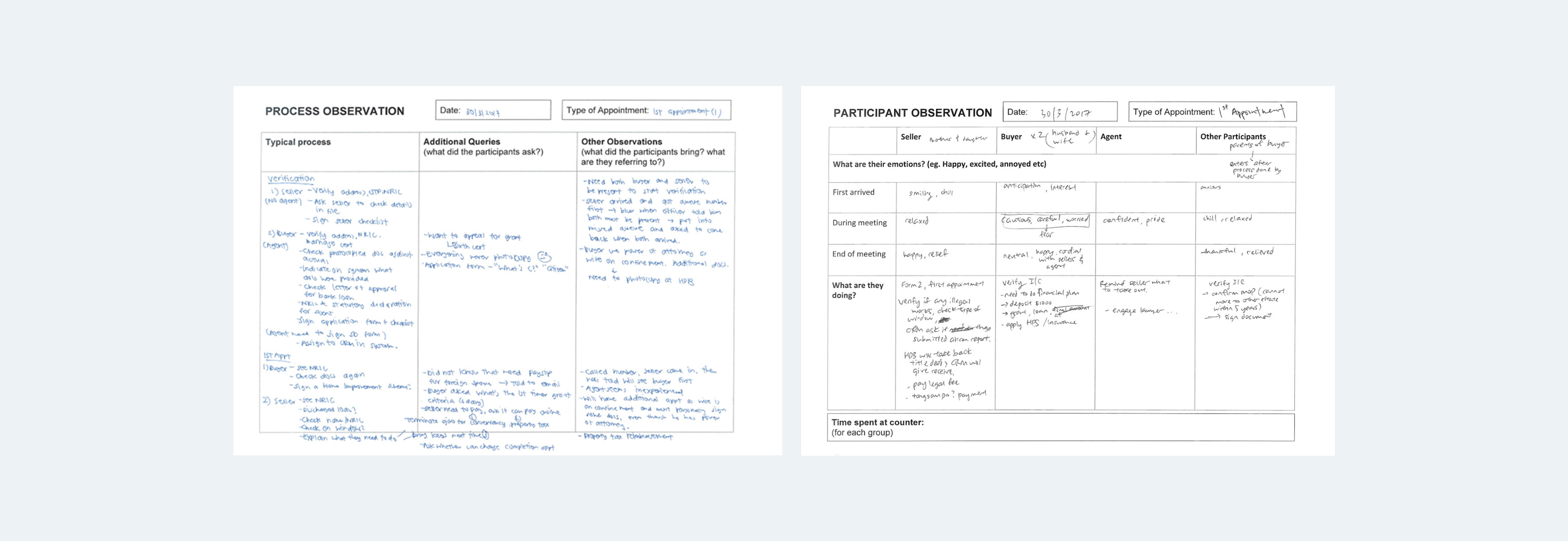
Taking the findings we had, we mapped the citizen's journey and identified opportunities that could be improved and streamlined. One of which was the removal of the first appointment. In the entire application process, a citizen had to visit HDB's service center twice. This means taking leave off work and finding a common time with your buyer or seller to make the trip down in order to verify and sign a few documents.
Additionally, the human resources needed to serve the appointments were limited. Thus, waiting for an appointment could take up to 2-3 months.
Following that, we mapped out the to-be journey map and service delivery for both buyers and sellers. Below you see one version of the proposed hybrid journey map and service blueprint for the buyer's application.
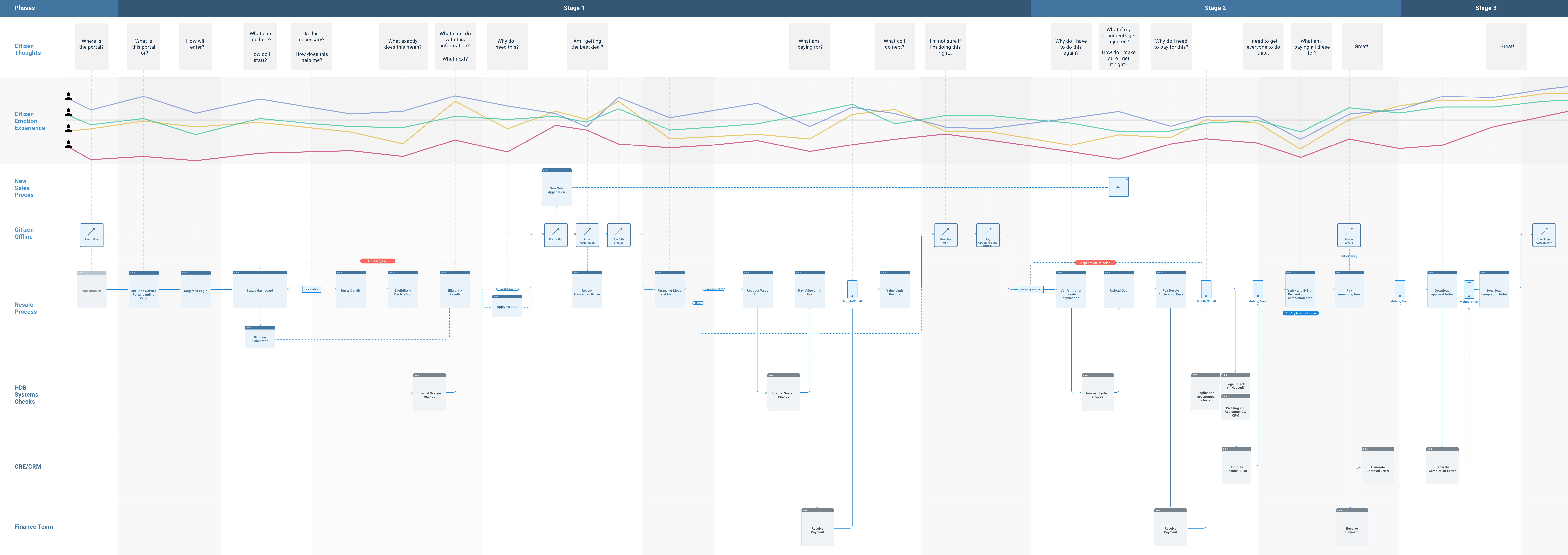
The four coloured lines in the map above represent our user archetypes and their emotional mindset as they go through the proposed process. We identified them by plotting our interviewees and survey respondents by their aptitude (tech-savviness) and attitude (independence).
The determined are tech-savvy enough to complete the application on their own and independent enough to want to do so.
The busy and lazy while equally capable chooses to be reliant on the customer service officer or their agent.
The fearful want to try doing the application on their own but lack the technical capability to do so.
The clueless refers to the minority who are completely unable to use a digital service due to multiple reasons. Being government, we cannot choose to leave them behind. As such, we stressed the importance of having a physical channel to cater to their needs to couple any digital applications.
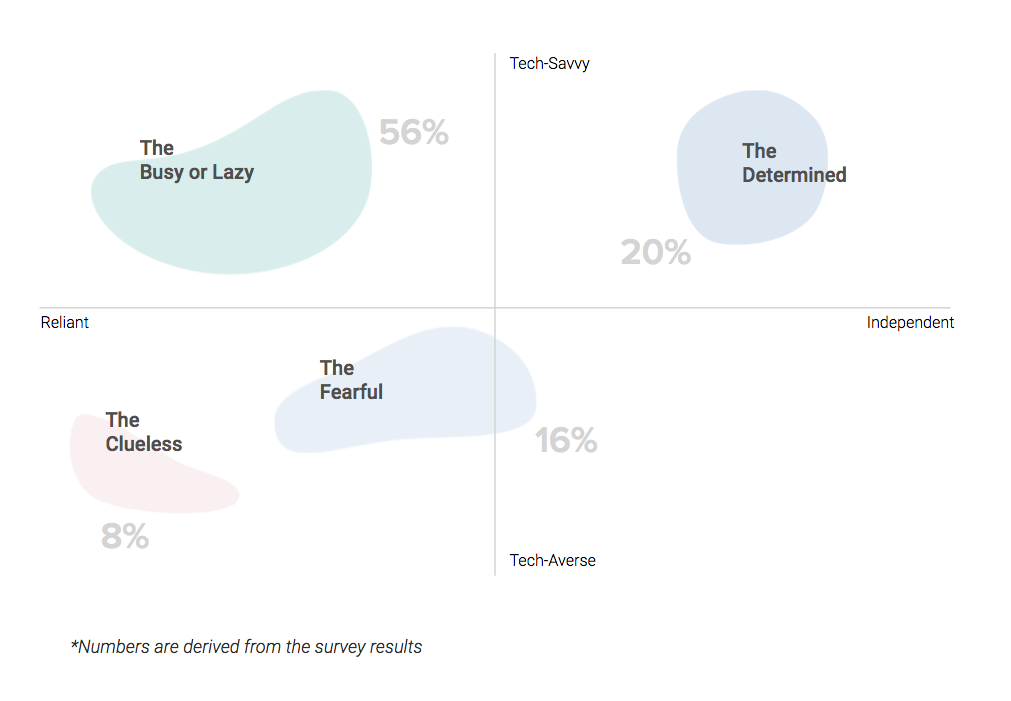
We proceeded by expanding on the behavioural traits and design considerations for each archetype, using evidence from our in-depth interviews and survey. Additionally, we identified the busy and lazy group as our primary users as serving their needs first allows us to serve more of the other groups at once.

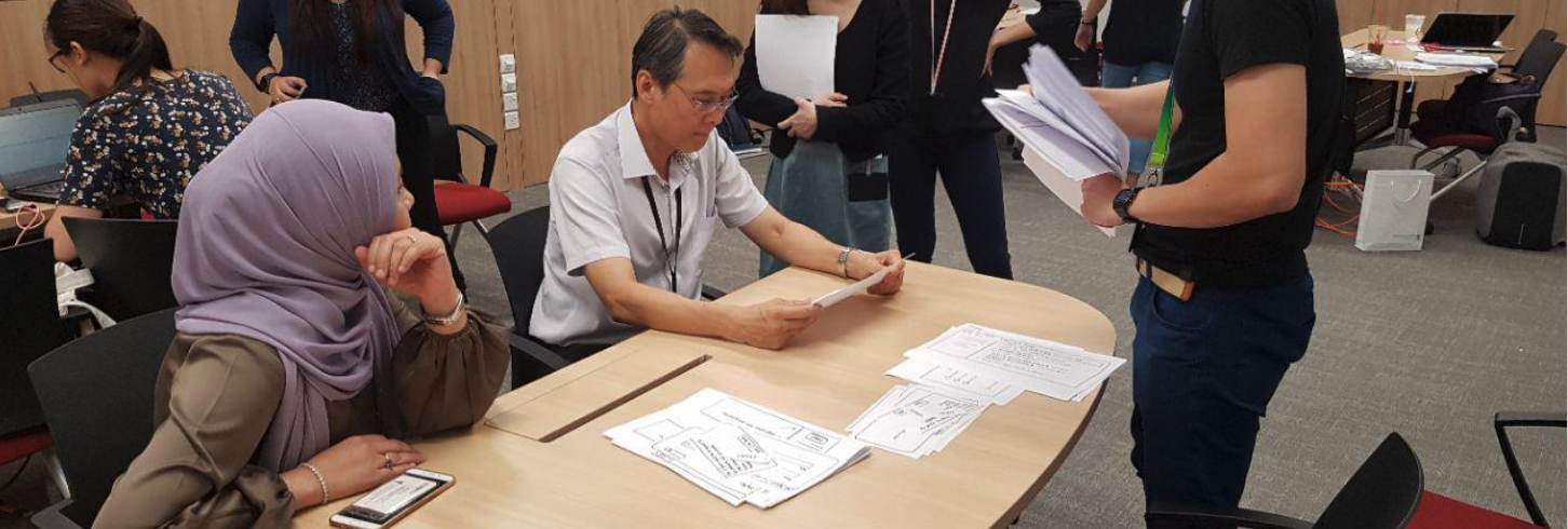
Satisfied with the to-be journey we've mapped and our understanding of the different user groups, we started paper prototyping. Given that a citizen would have to complete multiple applications over a span of 2-4 months throughout the process, we wanted to help guide them to the next step whenever they logged in to the portal.
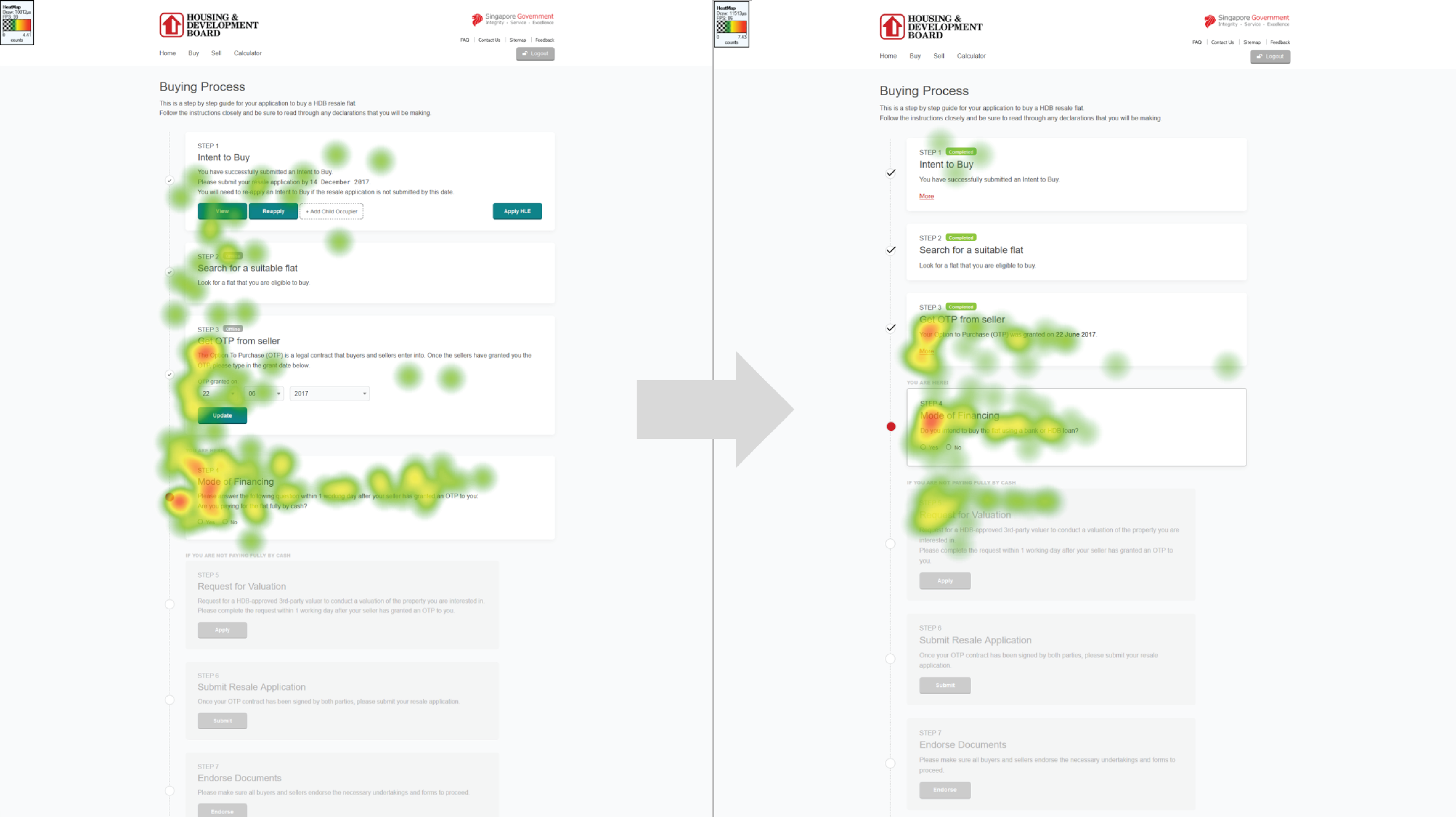
The current e-services website provides no indication to a citizen as to what they have completed and what they have to do next. Additionally, one would have to login for each step of the process. As such, we prototyped a portal where citizens will only have to log in once and see a timeline with the necessary steps to completion.
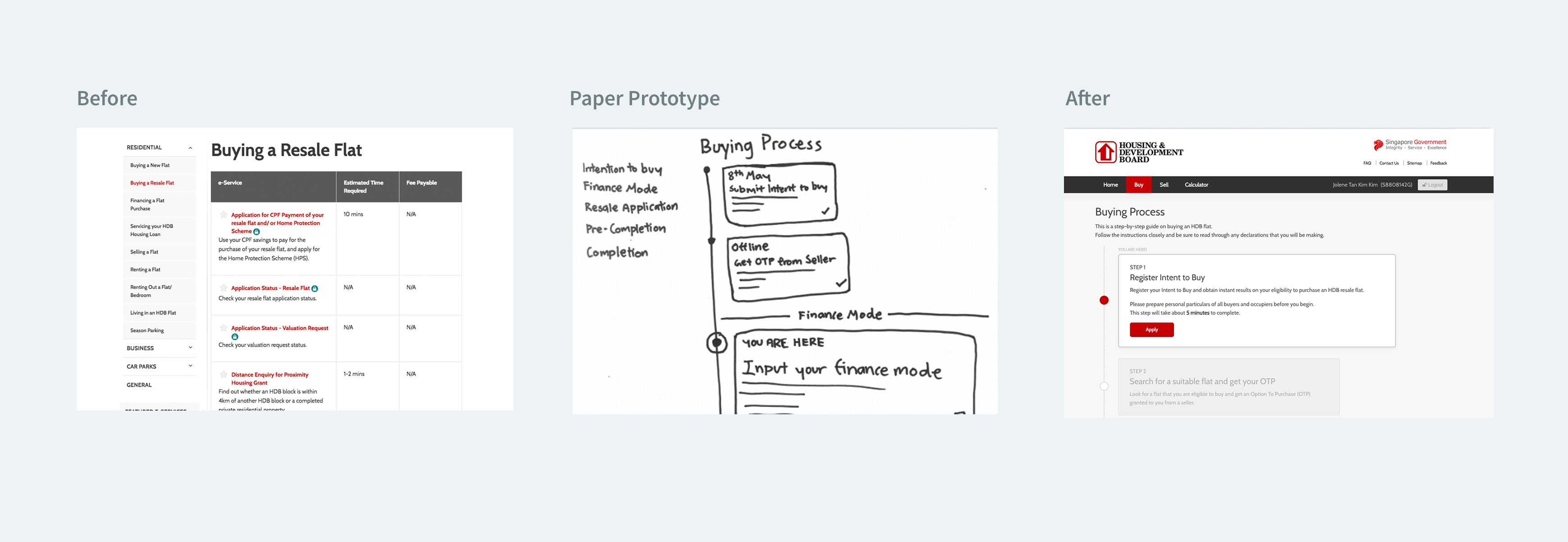
Guiding the user through the process would not be sufficient if each step was tedious to complete. We worked with the operations team to reduce the number of inputs they were requesting for and questioned the purpose of each.
Working with MyInfo (the personal data platform for all Singaporean Citizens), we managed to pull most of the necessary data, minimizing the need for citizens to enter them.
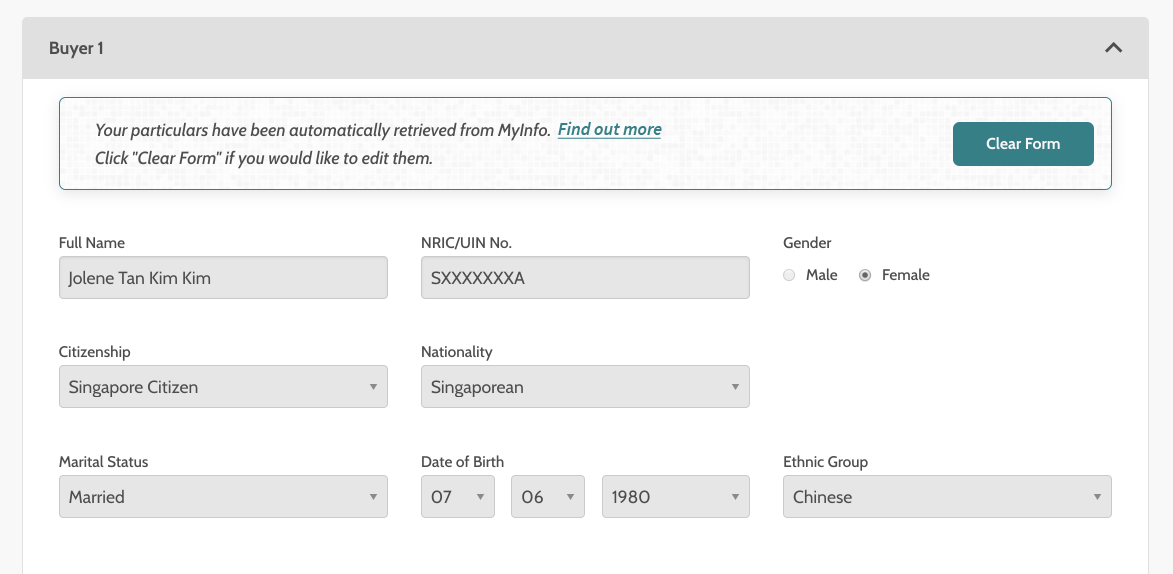
Interesting fact: Extra caution had to be taken when couples, who are buying a flat together, are working out their payment plan online. A good number of citizens are not comfortable sharing the balance amount in their retirement accounts (government-managed) with their partners.
To resolve it, we added an additional layer of friction, requesting the citizens to give explicit consent via their national identification credentials before pulling the data. Should they choose not to do so, a customer relationship manager would then serve as the neutral third party to work out their payment plan.
We also explored refreshing HDB's style which used a number of dark colours to a lighter palette to help make the complex information we needed to communicate more palatable (pun intended). Having a more conversational tone and taking a more casual approach (confetti!) was also briefly considered.
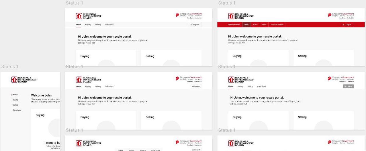
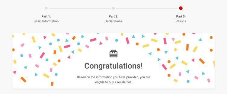
Unfortunate fact: A significant number of people who are selling their flats are not doing it for joyous reasons. (e.g. tight finances, inherited the flat from a relative who passed and so on) Thus, we made the decision to do away with the confetti and maintain a more serious tone.
With a clearer idea of the varous considerations, layout and style in mind, the team started coding the prototype using the foundation framework for testing and sharing. At every incremental stage, we arranged usability testing sessions to get feedback.
We used retrospective think-aloud sessions. Using recordings with the citizen's eye-tracking overlayed helped us further probe into the motivations underpinning their decisions.
The more we tested and refined the design, the more our users focused on the right pieces of information for task completion.
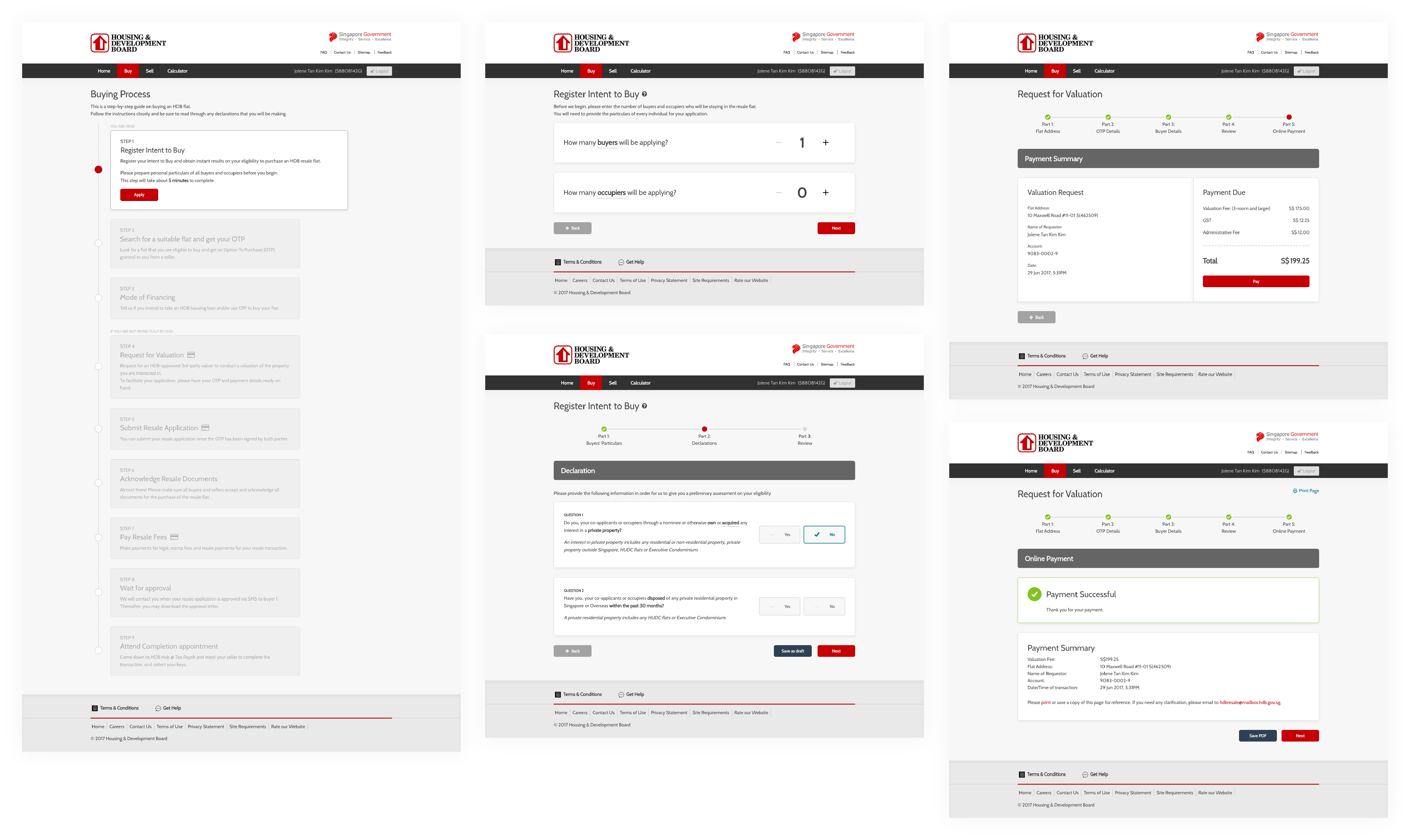
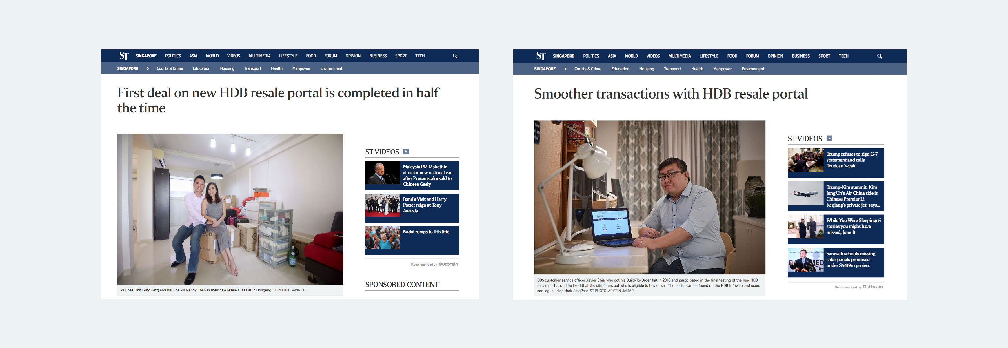
After months of work, we delivered the design and saw it go live on Jan 2018. Months of work was validated by actual citizen feedback through news coverage on the various citizens' experience with the portal.
On a more personal note, my greatest validation was hearing a new colleague exclaim after learning that I was involved in the project:
From a more quantitative perspective, the portal has served over 28,000 buyers and sellers since its launch a few months back. During that period, buyers who chose to complete the application process on their own instead of getting help has increased by 10% of the overall transactions.
The design for the portal is nowhere near perfect but it is a good first cut. I look forward to seeing how HDB will continue to grow and improve the portal.
Personally, I grew a lot as a designer, particularly in conducting research and testing my designs. I gained a new understanding of how operations at another government agency work and how the research we do can furnish them with a deeper understanding of the citizens.
I also upskilled in my familiarity with the foundation framework and my understanding of responsive web design. Coding the prototype allowed us to reach a fidelity closest to what the design would be like in production and helped us save the effort in creating a separate prototype for the mobile and tablet views (yay media queries!).
You may visit the portal here if you have SingPass credentials.

Masthead revamp HDB Resale Portal Meter UX Snapshots Other Projects