Other Projects
Masthead revamp HDB Resale Portal Meter UX Snapshots Other Projects
Meter is an app designed and prototyped for a call for proposal organised by the Singapore Energy Market Authority, Public Utilities Board and Singapore Powers in 2017. Over the duration of 4 weeks, my teammate and I ran research, design and testing sprints to develop our concept, ultimately winning 1st runner-up.
I initiated the project and got my partner onboard. I lead the design and prototyping efforts and assisted with the research activities. We pitched the project together and I fronted the questions.
Sketch, Invision
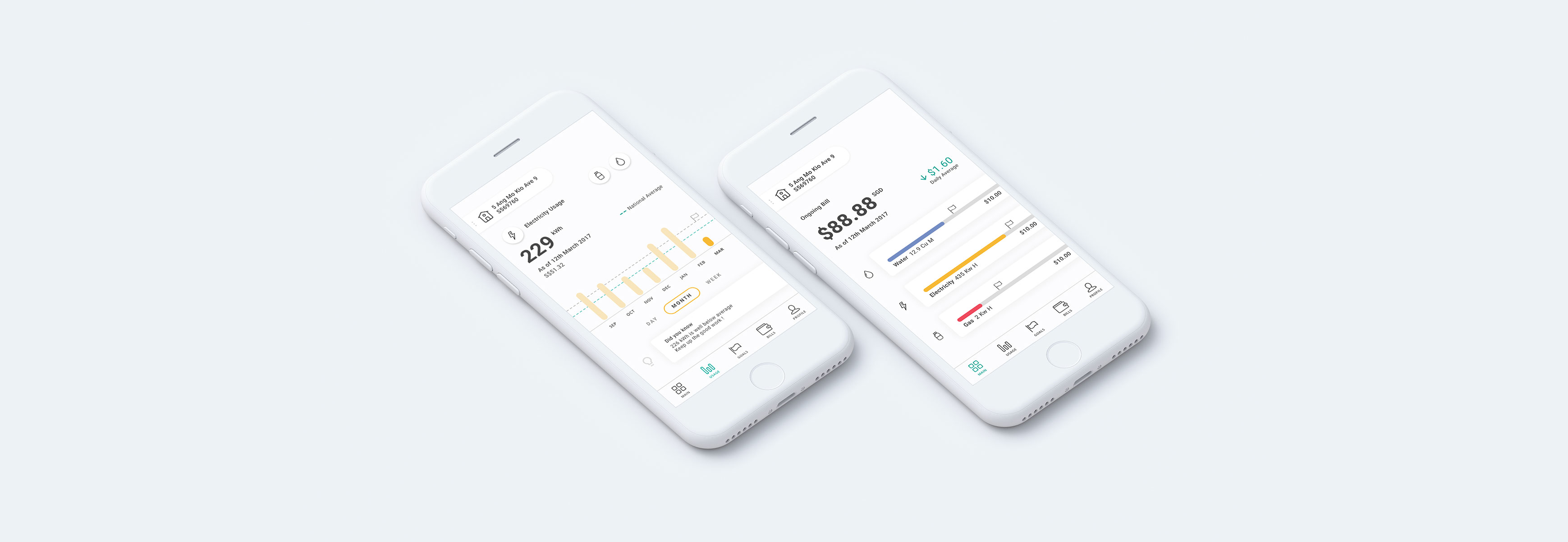
To provide timely and useful information feedback to consumers on their utility consumption (electricity, town gas, and water) via their smartphones.
As we started off on this project, there were two key questions that came to our minds:
1. What information would consumers want to see and why?
2. What is the order of importance for each information type?
Realising this was not a question we could answer ourselves, we sat down with 30 people to ask them about their utility and conservation habits. These people range from first-time house owners to singles who lived alone, to long-married couples, all who are staying in a wide variety of housing types.
After getting a better understanding of the different types of information required in the app, we wanted to know when could we best surface them. Based on the interviews, we considered the frequency of which one would need to view the individual pieces of information. From there, we sysnthesised our findings and identified the four main content categories for the app: Main (Quick Overview), Usage (Detailed Breakdown), Goals and Bills.
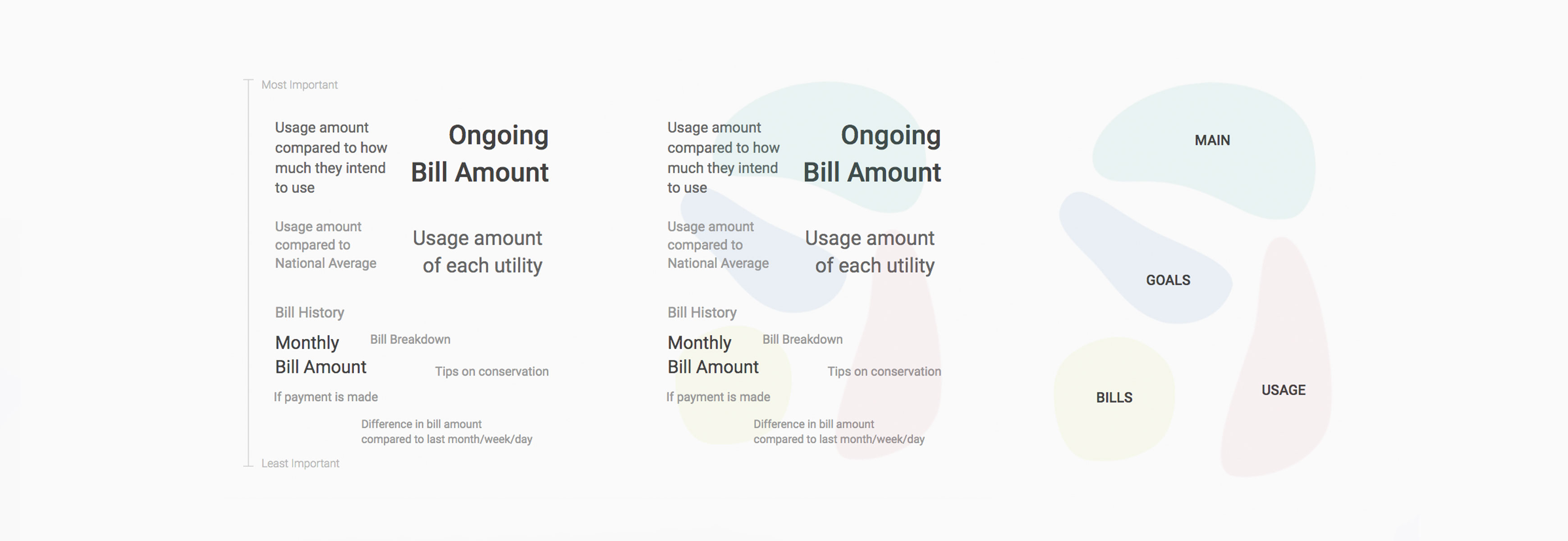
With the understanding that there are distinct content categories people are interested in regarding their utilities, we decided to proceed with a flat navigation.

From there, we started exploring layouts. One of the major design challenges was finding a way to represent data that was both comprehensible and accessible for all ages.
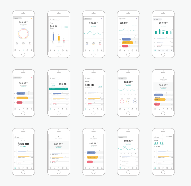
We flashed the different versions of the home page to different users and asked them what they remembered. That gave us a better understanding of what pieces of information stood out (and if it was aligned with our intentions). We settled on the sections below with a quick overview of the ongoing bill, the address this bill is relevant to and how close each utility usage amount is to the set limit. 🚩
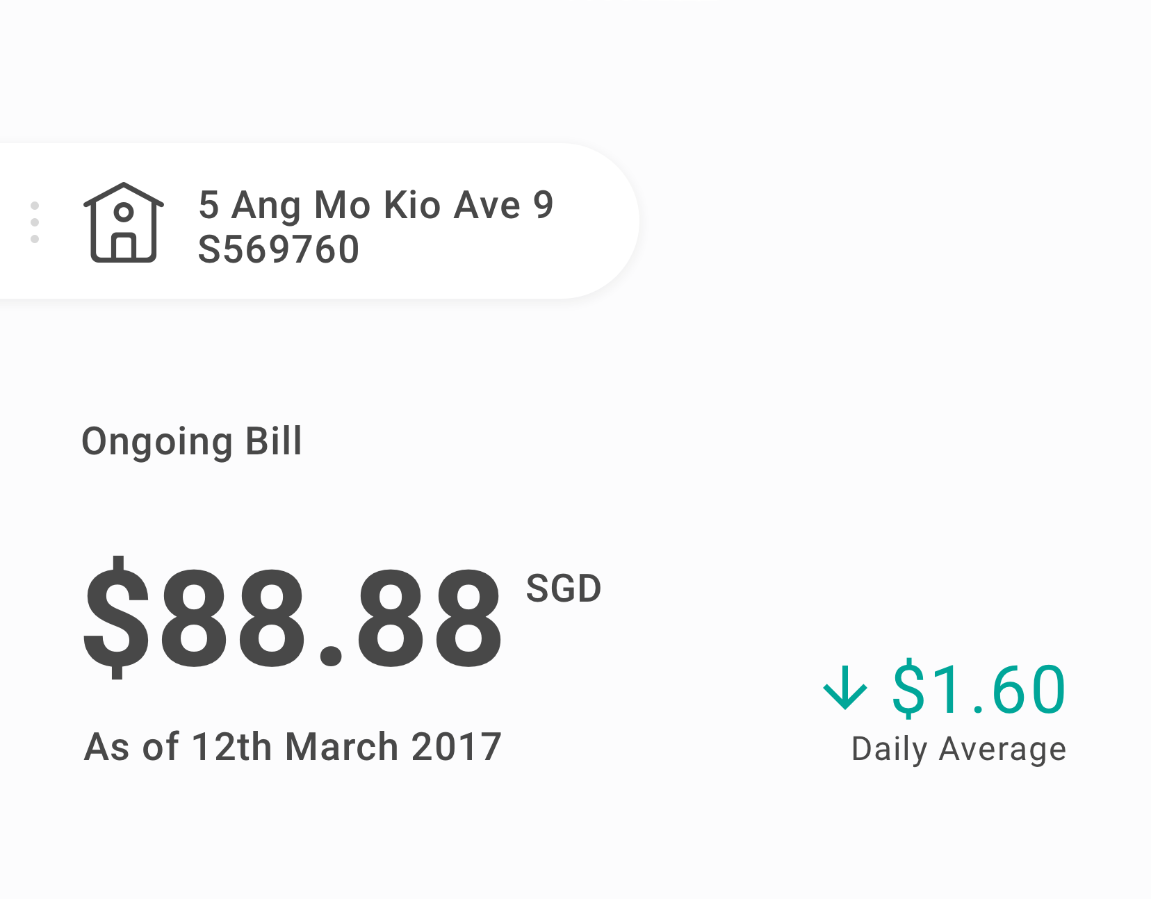
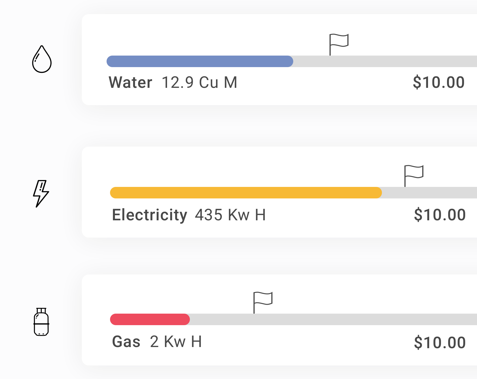
++ We made sure to have the utility names clearly labeled along with the colour and icons so as to cater to the colour-blind.
With a better idea of the direction we wanted to take, we quickly created clickable prototypes using invision. This allowed us to test with potential users and gather feedback to iterate our designs. After rounds of testing, we finally settled on the following UI for the proposal:
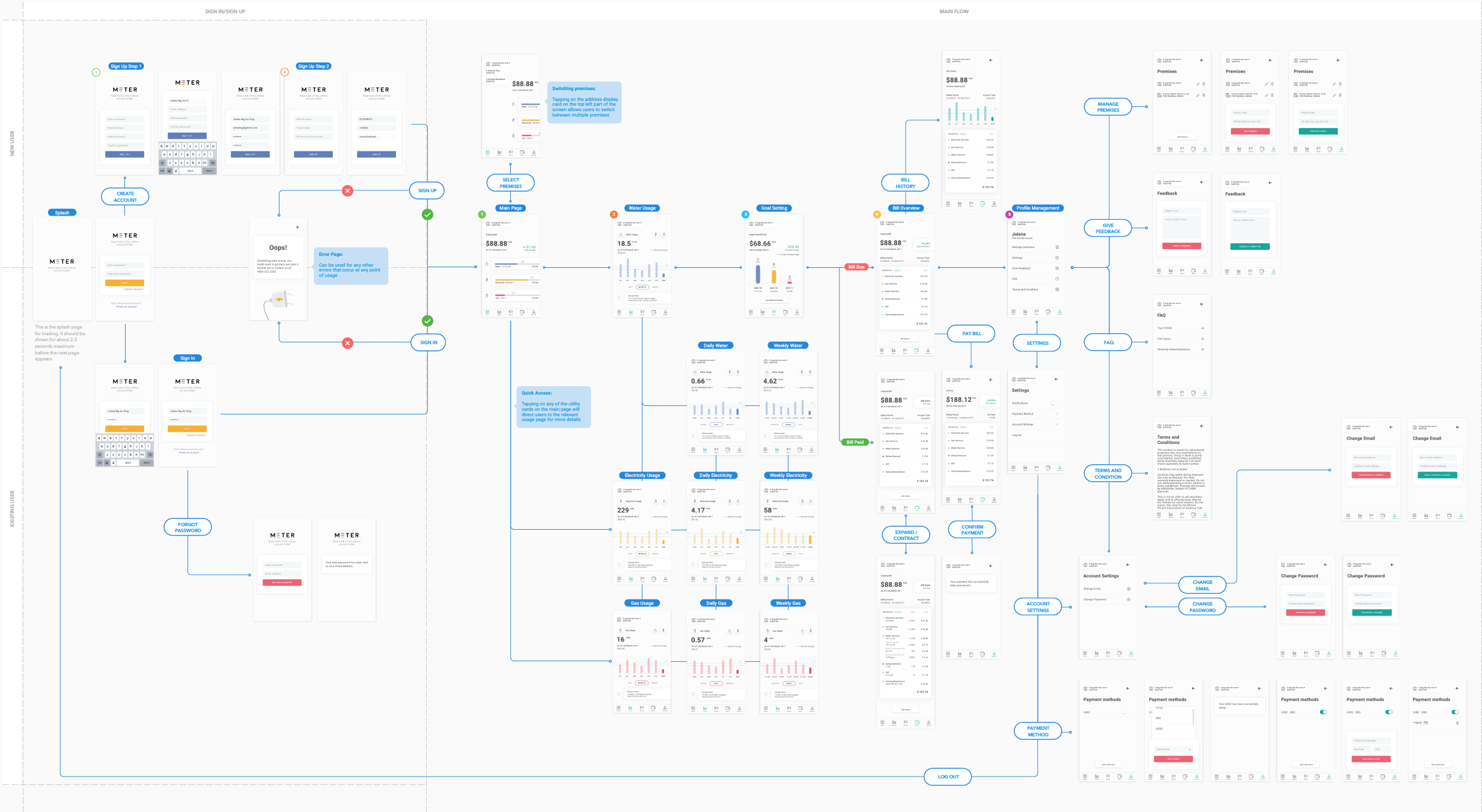
At the end of the fourth week, we presented our work to a panel of judges and won 1st runner-up. Check out the presentation deck below.
Balancing working on this project with my day job was an interesting experience. The more I worked on the project, the more I wanted to deep dive into the topic of energy conservation. I couldn't help but discuss it over lunch with my colleagues at times.
This project taught me a lot about taking ownership of a project and designing a native iOS app concept from scratch. I eagerly await seeing some of our efforts reflected in the developed app one day.

Masthead revamp HDB Resale Portal Meter UX Snapshots Other Projects